Today I had a happy alignment of the stars/schedules that resulted in 40 minutes with no children, so I ran over to look at flooring samples for our new dining room. We’re converting a porch (i.e., “junk dumping ground”), and when I say “we” I mean “my dad and various hired professionals,” because between us Paul and I have JUST enough do-it-yourself talent to plug in our own appliances without requiring outside assistance.
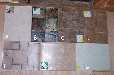
These seven samples are just a starting place. It’s the “I don’t have any idea what I’m looking for, and I have less than half an hour to look, so let’s get a little from all over the spectrum and see what opinions start to emerge” run. But all of them are from the more expensive section of the vinyl racks, because I always want to impress the salesperson with my refined taste.
B is my clear, hands-down favorite. I lovvvvvvvvve it. It is so gorgeous. The colors are gorgeous. I feel like I could just stare at it for years and never get sick of it. Each square is different colors and patterns.
But as my dad points out, it’s important not to confuse “the one that would look best framed as wall art” with “the one that would be best as a floor”—and B is very dark and very dramatic. Sometimes what’s best for a floor is “the one that disappears and you don’t notice it.” Especially if you are not much for keeping floors clean (*ahem*).
This photo is a little unfair, because more flash got on the lower three, and so they look cheaper and shinier. It’s also unfair because from this distance A, F, and G disappear completely: you can’t even see that A has a very pretty leaf-imprint pattern and that G has a very pretty vintage-y light green vines-and-leaves pattern (maybe if you click to see it bigger?). Well, and F really IS that boring, but I thought it was a good one for a “disappearing” option.
C and D look a lot like real stone, but I’m worried that will be too cold-looking in a room that doesn’t get much light. My dad’s favorite is C; he says he thinks D looks fake: it has “shadow-effect” (deliberate dark line along the edges of the stone) that doesn’t succeed and instead makes it look fakey.
The woman I talked to at the flooring place said E is the one that ends up looking really good almost no matter what. It comes in a number of colors, and she says she always thinks “meh” when someone chooses it, but then when she sees the finished job it looks terrific. Of all seven, it’s the one that most bores me. Well, no, I guess F is a little more boring, but at least F has the “look, ma, no lines!” thing going on, and I’d be interested to see how that would work out.
Well, I’ll be interested to see what Paul thinks. Or I will be, until he says “blech” about all the ones I like best. Right now, B is the one that makes my heart pound faster (it’s even more gorgeous in person), and none of the others seem right—but some of them seem CLOSE and I’d want to go back and see if I could find “something like this but darker” or “something like this but less cold-looking” or “something like this but more interesting.”
Let’s vote! What’s your favorite, and why?
********
Pay-it-forward updates:
Sublime Bedlam has a new contest up.
Moo’s Moo is showing the giftie she got, and posting a new contest.
Darn Happy is showing the giftie she got, and posting a new contest.